Crafting Custom Awards for The Greenport Classic XI
Forever Studios PRO first created awards for The Greenport Classic Bocce Tournament in 2024, for their tenth invitational tournament “The Greenport Classic X”. And when the competitors were reported to have drooled over the lucite awards that we had crafted for them, there was no question that FS PRO would be involved again when it came time to design and build the awards for the next year’s GPC XI.
With the small invitational bocce tournament being hosted on the north fork of Long Island, and attended by a fairly upscale crowd, the look of the awards had to scream “premium” in both supports selection and design. Our in-house designers had helped the Greenport Sporting Committee design their logo for the tenth event, and so they also came to us with a blank slate in 2025.
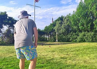
When it came to the visual language of GPC XI, we believed that tradition was something we had to respect. The Greenport Classic wasn’t known for changing all that much over the years; with many of the same individuals both invited to, and participating in the event. The recipe was simple: Mansion on the beach, with a field below a viewing deck, and the ocean beyond that. So we decided that evolution of the work we had done in 2024 was preferable to an entirely new look, and the Greenport Committee agreed.
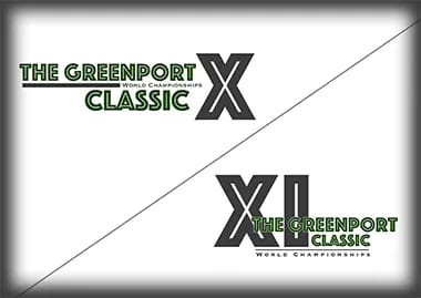
Our in house designers Kateryna Solohub and Greg Evangelista looked over the work that we had done the previous year, and then got to work; with Kateryna providing the 5 initial concepts for GPC XI, and Greg refining those into what became the finished logo for the event, and the awards.
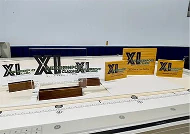
From there, it was time to bring that work over to our Creative Studio, and begin the process of translating the look and feel of The Greenport Classic into the awards we were going to produce. Because of how well received the awards for the tenth Greenport event had been, we were commissioned to not only produce awards for the tournament winners, but also for the runners up in both the team and singles competitions.
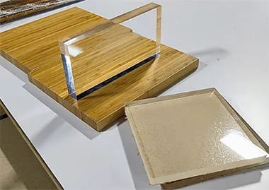
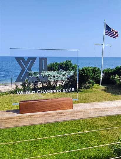
The supports selection for the winners’ awards was easy, with us opting for the same combination of thick lucite with walnut stands from the previous year. Determining what to do with the awards for runner up was a little more complicated, as we wanted to provide something that felt premium without overshadowing the awards for the tournament champions. We opted for a bamboo block material which we felt matched the champions’ awards in premium feel, without them being quite as “dramatic” in presence. We also made the decision to have the awards for the Singles Championship present as a bit larger and heavier than the awards for the Team Championship, as we were advised that the Singles Championship was the more desirable tournament victory. Otherwise, the sizes of the awards for the Team Championship were the same for both champion and runner up, with the Singles awards matching as well.
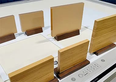
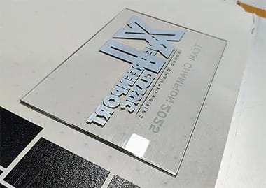
Once all the supports were selected, prepped and polished, it was time to nail our layouts, and perform test prints on our Canon Arizona UV printer. We decided on an execution that would utilize UV printing for the GPC XI logo on both the wood and lucite material, as well as laser engraving for the award recipient, placed below the logo. This would require all pieces to undergo two distinct production steps (after initial prep), with our Canon Arizona and Epilog Laser Engraver doing the heavy lifting.
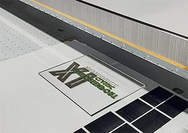
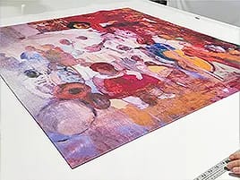
Test and calibration prints were performed on 1/8th inch acrylic, with both the UV and laser processes done on the test prints. These initial test prints are critical for any project like this, as everything needs to be dialed in to exacting standards to achieve the high quality output expected from FS PRO.
Digital files need to be prepped specifically for use with printing software and machinery, and many complicated settings on the machines themselves need to be accounted for as well. Any slight variable that isn’t accounted for during the prep and production process is extremely likely to lead to inconsistent outputs, and we aren’t afraid to show that it took more than one test print to get to where we needed to be. Why? Because in many cases, especially for other providers, countless test prints might be necessary before a viable print becomes possible. In the case of GPC XI, we were extremely happy to find that we were where we needed to be by our second completed test print.
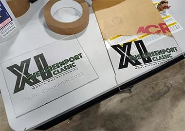
With our test prints completed, it was time to move onto the actual pieces themselves. We prepared the Team Championship awards first, as they all were of the same 5x7 size. While both the bamboo and lucite awards had the same visual layout, the execution was slightly different, as both the printing and engraving were being done on the front surface of the bamboo awards, while the UV printing was being done on the rear surface of the lucite ones.
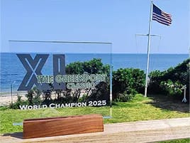
By UV printing the rear of the lucite awards, it created an amazing optical effect only possible by working with the thick lucite blocks being used for the project. Needless to say, the end result was something pretty special. And that continued to be the case as we adjusted the artwork and machinery to complete the Singles Tournament awards, which ended up looking positively staggering once they were completed.
Looking back on this project for The Greenport Classic, we have a number of takeaways that we think are valuable to clients of FS PRO. For one, design is critical, and designing with the end product and use case in mind is really non-negotiable. The Greenport Committee came to us with a pretty well developed idea of what their brand meant, and how they wanted it to be perceived. And we are pretty honored that they felt comfortable handing that over to us and saying “we trust Forever Studios to understand our goals here, and translate that into work that represents that feeling”.
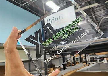
By knowing what the “hook, look & feel” were meant to be, and a pretty solid outline of what the finished awards would be, it allowed us to design the graphic design elements with all of that in mind. The logo was designed with the clear knowledge that we would be using it on certain dimensions of lucite (and later, bamboo), and we also knew that it would have to be a logo that would really pop through the use of UV printing.
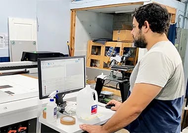
Secondly, this particular project really speaks to how material choices can totally make or break a product design. Just the simple fact that the awards are displayed on tournament day on a landing overlooking the field of play (usually with the sun beaming down), means that thick lucite ends up looking special in a way that other supports might not.
And the last big takeaway for us here at FS, is simply having to do with the role that true expertise plays in making something truly special for a client. A company could have all the expensive machinery in the world, but if the experts there can’t translate that into knowledge on how to leverage it all into a product, then it’s pretty much useless. Our production process effectively started the moment the Greenport Committee started explaining the “vibe” behind the tournament. The design and engineering staff involved were immediately translating that not only into ideas for the end product, but informed ones that accounted for all the unique capabilities of FS PRO, and how they could be combined to make something unique. And quite frankly, we think we nailed it.
Every project we take on presents a different set of challenges, environments, and creative goals. These case studies highlight how our team approaches real-world work (from planning and production to final installation) and what it takes to bring complex visual and historical projects to life.