Large Scale Art Reproduction with Patricia Nix
When FS PRO’s art world expert Craig O’Neil came back to our team with a special mission from renowned oil painter and Smithsonian alumni Patricia Nix, we knew right from the start that the project would be special.
Patricia has been nothing short of prolific during her career. Born in Texas in 1938, Nix emerged as a distinctive voice in American art through a combination of bold visual language, spiritual themes, and intricately layered compositions. Her work often draws on religious iconography, myth, and personal symbolism, blending elements of classical painting with dreamlike, contemporary structures.
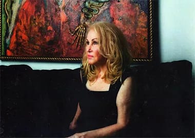
Her style is characterized by an almost architectural approach to composition, using both oil on canvas and mixed media constructions to explore themes of identity, transcendence, and the sacred feminine. And what Craig brought to us, directly from Nix herself, were a couple of very old (and somewhat weathered) transparencies of two works which she hadn’t actually seen in decades.
It’s a pretty typical situation for artists like Nix to end up selling off originals to private collectors over the course of their careers, especially in the earlier stages, and never have the opportunity to see them again. And in the case of these two works, named Fatal Attraction and State Fair Remembrance, Patricia Nix had nothing but one 35mm slide, and one slightly larger transparency.
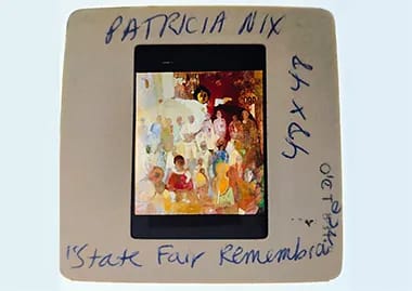
Our goal? To bring these works back to life in full size, so Patricia could enjoy them again as part of HER private collection. But to achieve this would take some serious effort, and serious talent. Making the jump all the way from small transparency to a 50 or 60 inch tall reproduction requires a ton of artistic know-how, and a million small decisions that all add up to a final product that either works, or doesn’t.
In this case, that chain of events starts with helping those old photographic transparencies make the jump to digital. And so we assigned the job to a two engineer pairing of Lucas Solomon and Emilio Lopez. They began by prepping the transparencies. This involves using a selection of VERY light brushes and cloths to remove whatever debris and dust can be cleared from the transparencies. In nearly all cases, solvents must be avoided, as the likelihood of a good outcome is low.
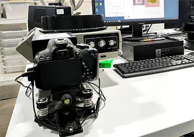
When the transparencies have been cleaned up as well as possible, it’s time for them to be captured. There are a few different methods for capturing the digital images, and in this case, we found that the best capture method for the 35mm slide of State Fair Remembrance was through use of our SlideSnap device, while the larger transparency of Fatal Attraction was photographed in our darkroom space that we use for the capturing of artwork through photography and specific lighting setups.
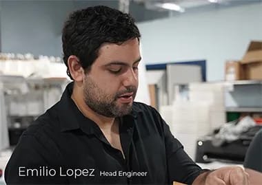
Once the initial digital images are captured, it’s time for the first round of digital alterations to the source image. Emilio was the visual arts pro responsible for this first pass, which includes removing any imperfections from the digital image in Adobe Photoshop. These could be imperfections in the transparency itself, or dust & foreign material that may have otherwise ended up as part of the capture.
Then, when this process is complete, it’s time to start planning out how to reproduce the artwork as accurately as possible. And this is where our art & media experts come in. Because in the intervening years between when the transparencies were initially created and now (in 2025), time has made some “changes” to the color and composition of the transparencies through physical degradation. Research is necessary to best determine what the original works would have looked like, and how to make adjustments to our digital captures in an effort to make them print ready. And in this case, that meant Craig O’Neil discussing the original mediums and supports with Ms Nix, as well as her recollections as to what certain color expressions would have looked like in real life, versus what could be seen in the digital captures we had prepared.
This also helped inform our determinations as to what canvas material and print processes would best be able to capture the proper look and feel.
Once our research stage was complete, we made the determination that we would perform latex printing using our large format HP latex printer, on Elements Fire Opal Canvas. And then it was time to move onto the next stage of the project; with the knowledge we had gained informing us as to how best prepare both the digital source imagery that would be prepped for print, as well as the calibration of the printing machinery.
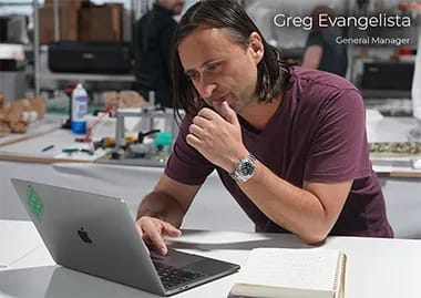
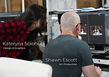
The preparation of the print ready digital imagery was completed by our in-house designer, Kateryna Solohub, under supervision of FS General Manager Greg Evangelista. This team worked together to first match the digital images to exactly the same color, brightness and exposure levels seen in the original transparencies. This is done with color calibrated computer monitors, and specially created lighting tablets which transparencies can be laid on to view them as intended during color matching work.
Once the digital imagery had been properly matched to the physical imagery, a second set of adjustments were made according to the information that Craig O’Neil had gathered from the artist herself, as well as the research that had been performed on the pieces. These adjustments were performed with the intent of reproducing EXACTLY what the works would have looked like back when they were created. And as such, significant changes had to be made to the digital imagery before the pieces were “print ready”.
But just because the digital imagery is print ready, doesn’t mean we’re ready to print. And every aspect of the latex printer must be carefully adjusted, with test prints made along the way, to ensure that the final output matches exactly what is seen in the print ready files. Latex printing is a bit finicky by nature, as every last small adjustment affects the output. This is where Engineer Emilio Lopez teamed up with our Art Printing Specialist Shawn Escott (who is himself a prolific oil painter), to nail these adjustments during the test printing process.
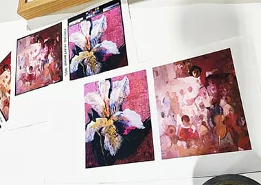
To achieve a great latex print, the parameters have to be matched to the medium you’re printing on, and in the case of Fire Opal Canvas, we found that it required an even more accurate touch than usual.
Ink temperatures had to be fairly high to get the blending of the ink into the canvas just right, and color levels had to be tweaked just right as well, with reds boosted a bit, yellows given a relatively large boost, and blacks being carefully managed so they didn’t overpower other parts of the print. Vacuum settings on the print bed had to be set rather high as well, to make sure that the material wouldn't bunch or stretch during printing. And the amount of print passes was set fairly high, with the material being fed through the print area slowly.
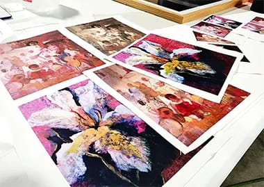
The complexity and color blending of Patricia Nix’s work was an extreme challenge for us to get right, as the amount of layering and expressiveness in her use of color was amazing. And a number of test prints were absolutely necessary, with adjustments made between each pass. We were 100% committed to making sure that all of the great flourishes of oil paint mastery, and the nuance of the color and brush work wouldn’t be lost in our reproductions. And once our final test prints were done, we were VERY confident that we had nailed it. But there is a big difference between printing 8-12 inch test prints, and stepping up to the extreme large format final prints.
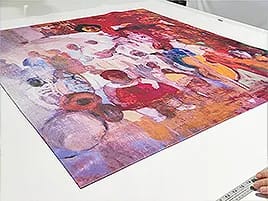
The first piece to be sent to final print was Fatal Attraction, and with how we had configured our latex printer, moving slowly and deliberately, it was a tense wait until we were able to finally see if all our hard work had translated into a final print that really reflected the quality of work that we were aiming for. Thankfully, once the bottom of the piece began to emerge from the HP latex printer, we immediately knew that we had gotten it right. The complex layers of pink and green towards the bottom of the piece were showing the dimension we wanted to see. And by the time the brighter whites and yellows were emerging from the printer, we could see a super clear and well defined contrast there as well.
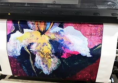
The parts that were supposed to be dark were dark, while the parts that were supposed to be bright were simply glowing. And we managed to keep the complexity of the work intact. Once the entire print had emerged, the entire team took a step back and simply enjoyed the fine reproduction we had created. It looked exactly like the vibrant oil painting we had hoped to create.
But of course, State Fair Remembrance was next, and if we thought getting Fatal Attraction right was difficult, this one had us on our toes. But lo and behold, all it took were some minor adjustments to the printing color profiles, and the beginnings of the next piece had us all pretty excited.
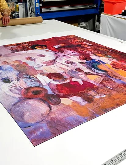
It was kind of difficult for any of us involved with the art reproduction side of FS PRO to do anything other than stand there and wait with bated breath while State Fair Remembrance began to come to life. This piece was a warm and largely red toned affair. With a thousand different hues of reds and browns. But most critically, there was a decidedly very BLUE aspect to the work as well, and the whites in the work were very decidedly a blue temperature.
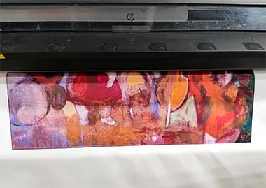
To get both extremely warm and well defined reds, and naturally cool blues to be represented in one piece would be something of a miracle. But by the time the piece was half done printing, we were already celebrating. It was all there and brought to life in one of the best large format prints we think we’ve ever completed here. And by the time the top part of the work was coming out of the printer, it was high fives and handshakes all around, as the ultra challenging top right portion of the piece, with its absurdly layered and robust reds, had been recreated in stunning detail.
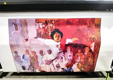
Somehow, our FS PRO reproduction squad had gone two for two on a couple of the most complicated (and important) pieces of art reproduction we had ever been tasked with. And now it was time to get them off the printer, and properly evaluated from top to bottom by Craig O’Neil. Craig was looking to get the work over to Patricia as soon as possible, but there was absolutely no way that he was going to let either piece go out the door if they were anything less than perfect.
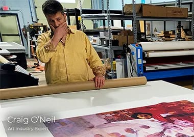
Craig even went so far as to climb up and stand on a chair to evaluate the pieces from above (and assist in properly rolling them up for delivery to the client). And we’re glad he did, because it was only a few hours later when he called over from Patricia Nix’s living room and delivered the good news to the team.
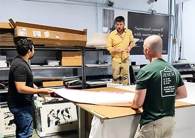
Ms. Nix had gotten a bit emotional at seeing these works again, remarking that it felt like being reunited with her own children after years of being apart. And upon hearing that, everyone here at Forever Studios took a big deep breath… Before realizing that it was almost inevitable that Craig would be coming back with at least two more transparencies from Patricia’s residence, and it would soon be time to get to work yet again.

Every project we take on presents a different set of challenges, environments, and creative goals. These case studies highlight how our team approaches real-world work (from planning and production to final installation) and what it takes to bring complex visual and historical projects to life.